Creating A Classic
Simon explains why he would have selected Mark as the winner of the book cover challenge.

Displaying your work on the cover of a great classic at Penguin would clearly be a source of immense pride for any artist. Therefore, winning this particular challenge is the greatest reward a Work of Art contestant can earn, short of winning the overall prize of a one man or one woman show at the Brooklyn Museum of Art. It is a bit like a Tour de France cyclist winning the main mountain stage. This does not preclude him going after the overall prize, the yellow jersey at the end of the Tour in Paris.
In the pre-digital age I was a voracious buyer of LP's and subsequently of CD's. While browsing through albums in a record store, I would often buy a record purely because I was attracted to its cover, even if I was not familiar with the music. The instant visual impact of a cover must be a prime concern for any literary or musical editor.
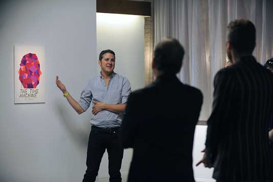
The objective of the challenge for this episode was very clear, yet several contestants chose a far too 'artsy' path that could in no way result in victory. I was sorry to see Judith leave the show. I have respect for her as an artist and I like her as a person. She tuned in on a psychic link with Jane Austen when she decided to write the title of the book in mirrored reverse writing. It was a way, however, to instantly count herself out as a contender for this contest, as you surely could not expect a major commercial publisher to go for a cover where you could not read the title at first glance. I agree with the choice of the judges in singling out the works of John and Mark. I understand why they went for John's seemingly more artistic and less overtly commercial cover. As someone walking into a bookstore without any preconceived ideas what to look for, the one cover that would have instantly caught my attention would be Mark's. Had I been a judge, I would have pushed for him to be named the winner of this challenge. The cover he made plays up to his natural strength and is the one that resembles most closely so far the kind of work he showed when he applied to be a contestant in the initial casting for the show. Miles had a truly original way to approach the challenge, however the process was more interesting than the end result. His work could have possibly functioned as an object, but definitely not as a book cover.


